![LT logo square.png]](https://portal.lightningtools.com/hs-fs/hubfs/LT%20logo%20square.png?height=40&name=LT%20logo%20square.png)
The scenario in this walkthrough is that you have two Lightning Conductors on a page, where the first LC displays the Title values from a list, and the other LC displays details of the item that a user selects from the first LC. NOTE: Dynamic Connections (connecting two web parts on a Modern page) only works in SharePoint Online, but the Adaptive Card part of this article will also work in SharePoint Server. You could also use this idea to display multiple items as cards rather than in a tabular gridview.
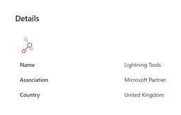
The following steps will create a tile that looks like this:
1. Before opening the configuration of the Details Lightning Conductor, select an item on the Names LC - this is so you'll see some sample data in the Details LC, to help you build the Adaptive Card.
2. Open the configuration panel of the Details LC, and on the Web Part tab switch Display Provider to Adaptive Cards.
3. The image part might be a little tricky, and will depend on how you've added the image to your list. In this walkthrough, we're using the SharePoint Hyperlink/URL field, that can be displayed as an image. So we've added a Lightning Conductor calculated column to strip off the second URL that SharePoint stores in that field type:
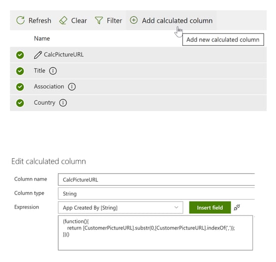
(function(){

return [CustomerPictureURL].substr(0,[CustomerPictureURL].indexOf(','));

})()
Note: CustomerPictureURL is the internal name of the example field containing a company logo. This function locates the comma that would be in the SharePoint value, and only returns the part before that - which is the URL of the image.
4. On the Columns tab, select all of the columns you wish to display, including the above calculated column.
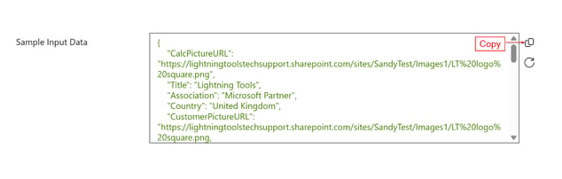
5. On the Display tab, you should now see sample input displayed, something like below. Click the Copy icon to copy the contents of the window to the clipboard.
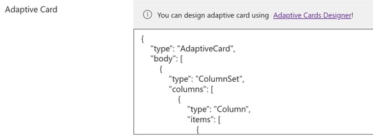
6. Open Microsoft's Adaptive Card Designer using the link just below the Sample Input Data box. A sample Adaptive Card will be displayed. Click New Card in the upper left, and select Blank Card.
7. Paste the Sample Input Data from the Lightning Conductor into the Sample Data Editor section in the lower right of the Adaptive Card Designer (removing the { } that are already there).
8. Please see the animated walkthrough below for the part of this process in the Adaptive Card Designer.
9. Copy the contents of the Card Payload Editor into the Adaptive Card box in the Lightning Conductor:
This should now render a selected list item using your Adaptive Card design!
Published May 8, 2023